


Stop Mapping the World
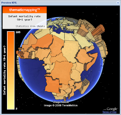
16 Jun 2008The Thematic Mapping Blog has been on a 3D chloropleth jag lately, exploring all the ways to display global variables on a map of the world. The technical achievements are all very nice, but the actual display of the useful numbers, is as usual totally screwed by the intractable fact that countries are radically different sizes!
The trouble with chloropleth maps, is that you’re trying to display numerical data visually, but one of the most visually arresting features of your display is a variable that you do not care about, the size of the regions.
What do I get out of the global map display of world data, that I don’t get out of a simple rank-ordered table? A and B are high, and A and B are on the same continent. That could be done by coloring the rank order table by continent. A and B are high, and A and B are adjacent. That’s harder.
I’ve really become fond of the cartogram approach, as a partial solution to this problem, but it has it’s own problems.

We’re in for a whole slew of this kind of stuff, with the US election offing, since the Republicans uniformly win the large less dense counties, every chloropleth map visually overstates the results in one direction, no matter what the cartographers do. How do you show San Francisco County on a map of the continental USA? Does it get 1/2 a pixel even?