


Best Election Map
05 Nov 2008I’ve always been a bit of a connoisseur of election maps, but most maps don’t really tell me much that I don’t already know. The maps I like best are those that show smaller geographies than usually reported (in Canada, maps of polls instead of ridings, in the USA, maps of counties instead of states) and those that show changes from previous results – “delta maps”. The New York Times is currently running one on their front page, here’s a snapshot.
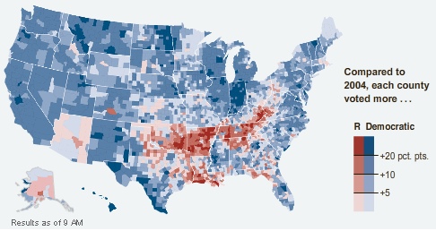
The colors are not reflective of number of votes, but of direction of movement. Hence, Montana colored blue even though McCain won it, because in every county Obama did better than Kerry did in 2004.
One of the things I found curious about the numbers in the paper today is that while Obama won a strong Electoral College victory, his popular vote share is not much different from the share Bush won in 2004, and Bush won a squeaker in the Electoral College. The map tells the tale.
McCain didn’t lose support across the board, he actually improved on Bush in places, but mostly in places where the Republicans were already winning smashing majorities – more votes in Alabama don’t get you any closer to the Presidency. So a respectable showing in the popular vote translates into an Electoral College whomping.
Somewhat disturbing is how nicely the red areas map into the phrase “rural white voters in former slave states”. History just never goes away, does it?